

Saturday is the Feast of St. Ignatius Loyola—two years from the day that I stepped down from a twenty-six-year campus ministry career to pursue a freelance existence. As the second anniversary of my “third act” approaches, I’m delighted to announce that my next book, Finding God Abiding, will be coming into the world on June 7, 2022, courtesy of Woodhall Press. Here’s the cover, designed by the very talented Asha Hossain.
So much thought and work go into cover design; that’s what the rest of this post is about. If you’re intrigued, read on!
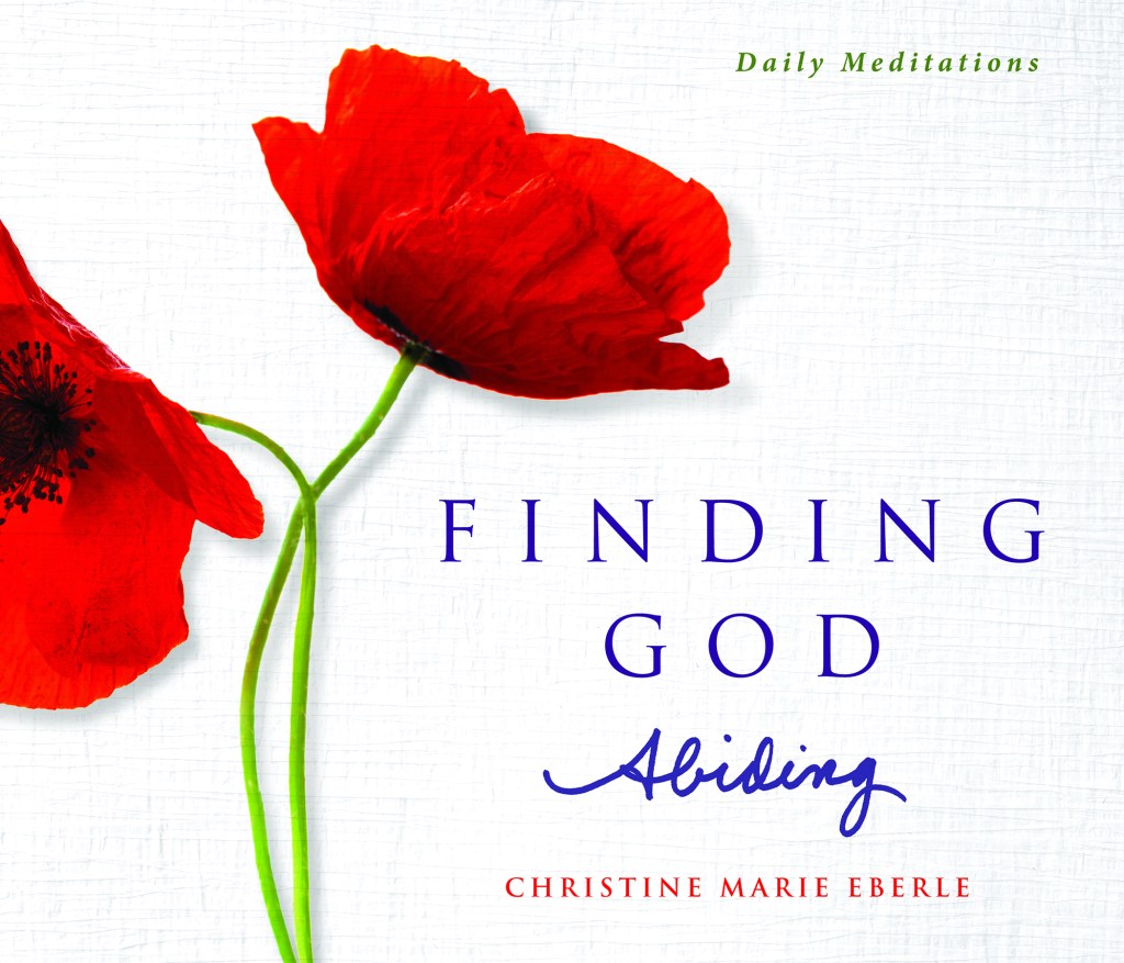
Asha had an unenviable task: design a cover that would be “just like the first book, only different.” In other words, make it clear that this is a companion volume to Finding God in Ordinary Time, yet offering fresh bread. Here’s a peek at the thought process (to which many of you contributed via Facebook and Instagram this week):
The Background
Did you even notice the background? It’s not just white; it’s a woven texture, alluding to one of my overarching themes: life as a tapestry. In “A God Who Abides,” I wrote:
“The stories in this book are organized around four actions that run like threads through the tapestry of our lives: perceiving, becoming, embracing, and releasing. We awaken to the world around us, discover and rediscover our path, practice love in its many forms, and grieve the loss of much that we hold dear. These movements are neither sequential nor singular; we go back and forth like a weaver, creating a unique tapestry on the loom that is our life.”
The woven background is such a subtle detail; it may never register in the reader’s conscious mind, but it adds to the overall impression.

The Poppies
On the cover of Finding God in Ordinary Time, the hummingbird is what people really remember. For this book, we wanted something equally memorable. I shared with Asha a paragraph from my chapter “Finding God in a Fire Siren” and suggested she might find inspiration there. A few days later, I emailed her back to say, “Or poppies! I love poppies! If you find good image, I can always change the language.” And that’s what happened. Since then, I have given a lot of thought to the significance of poppies, and have a whole pastoral reflection to share, but that will keep for another day.
The Colors
The red and the green were obvious, to match the poppy flowers and stems. But red + green = Christmas, and red + green + white = the Italian flag. Not that I don’t love Christmas and Italy, but neither is what I was going for. When Asha introduced purple for the way it balanced the other colors, my mind went straight to the liturgical year: green for Ordinary Time, purple for Advent and Lent, white for Christmas and Easter, and red for Palm Sunday, Good Friday, and all those martyrs’ feast days. My book traces God’s abiding presence through the joys and travails of our life; how appropriate to have a nod to the whole sweep of the liturgical year–birth, death, resurrection, and everything in between–right there on the cover.
The Fonts
Oh, my goodness. Most of it was easy; “Finding God” and “Daily Meditations” are in the same fonts as we used for Ordinary Time (Trajan Pro and Minion Pro, for the curious). To convey a sense of freshness, Asha presented a choice of fun script fonts for the word Abiding. I wasn’t crazy about either one, but they arrived as I was about to take a walk with my friend Rose—who can always be counted on for an opinion—so I printed out the samples and headed out the door. After much discussion (and a three-mile hoof, and some wine), Rose said “You have nice handwriting. Why don’t you write it yourself?” This was SUCH an Enneagram One thing to say, and to agree to—one of the many reasons Rose and I get along. Three sharpies and almost two hundred attempts later, we had a winner.
But still, I wasn’t sure. I asked Asha to show me what the cover would look like if the whole title was in the same typed font, and it looked BEAUTIFUL. Elegant. Dignified. What if I used my own handwriting, then regretted the decision? What if I put that little bit of myself out there, and it made me cringe every time I saw the book?
Can you see where this is headed?
If I’m worried about putting too much of myself out there . . . if I’m afraid of letting people see my messy edges and imperfections . . . well then, frankly, I should be writing some other sort of books. Science fiction, perhaps. A Brief History of Mathematics. Bicycle manuals.
The comment that gave me enough courage to move forward with the handwritten Abiding was from my friend Emilie, who wrote this beautiful observation: “The handwriting provides a suggestion of something personal within.” Indeed, it should. Finding God Abiding includes chapters on everything from body image to the clergy scandal, from feeling broke to not being able to stop crying. (Also nicer stuff.)
If I can be brave about all that, surely, I can write my own name on the cover.
Now, back to editing the manuscript . . . deadline, September 1st!


